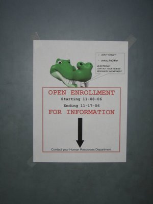
It’s that time of year again. I know it’s that time because HR has put up little signs on all the doors. We’re a pretty simple minded folk at my office, so if they didn’t cater to our special needs with little fliers on all of the doors, we probably would forget why we came into the building in the first place. Without my nameplate, I’d probably forget where I sat too.
I will openly admit that I have no formal training in layout and design. I didn’t study it, I don’t have a degree in it, I don’t even qualify as an amateur. But when I saw this little sign this morning, I just shook my head. I’ve taken the picture at close enough range to be able to read everything on there, but imagine yourself about 10 feet back of this. What’s the initial information that you gather from it? Just so we’re clear, there is a second door that you pass through on the way into the building. The first one is the difference between being inside and being outside. There is a short hallway. If you go to your right, you can go up some stairs, but if you continue on straight, there is another door to pass through. I’ve been working at this office for about three and a half years now. On Monday, for the first time I can recall, the second door was closed. Several people ran head first into the door that day.
6 comments:
at first glance, I thought that gator was two frogs doing some kind of acrobatics.
why is the gator talking to me? its toothy. what does it have to do with open enrolment? and why is the black arrow larger than the contact name?
tsk tsk, Jon's workplace. TSK.
i am thoroughly confused.
but i guess if you don't get your dental plan in order, that thing will come and bite you.
?
still lost.
I'm making a mental connection to something like an employee falling off a ladder while updating a "Days since last accident" sign. Are you saying the normally-open second door was closed so people would see this notice, or were people looking "down" instead of ahead? Or is it just the simple ludicrousness (ludicrousity?) of the impossible directions?
Expiring minds want to know.
Syar: I’m not sure who our graphics editor is either…
This flier raises many questions, no doubt about that. The Gator is in reference to a program we use in our everyday work, but it has nothing to do with the enrolment process or HR. The arrow just kills me. It’s on all the doors, pointing seemingly to the ground.
Cadiz: You should be, this is a terrible sign. I believe someone was trying to be creative.
Jam: Actually, the door was closed the day before the sign went up, so I’m not sure what that was about. The sign is now up, and the door is back open. Please don’t hurt yourself trying to find rhyme or reason behind it. There doesn’t appear to be any.
You know, a moderately cynical person might interpret the directional arrow as a "colorful metaphor," a thinly disguised way of telling someone "go to hellO FROM YOUR FEIENDS IN HR!"
I'm just glad I'm not moderately cynical.
I'm no subject matter expert, but I do have some background with print layout and design.
So my educated opinion is that this is a horrible, horrible sign.
And as far as the content goes, are there more than one human resources departments? Is this sign meant to inform people from multiple companies?
I'm actually getting a little bit mad at whoever made this sign. I'd better stop now.
Post a Comment